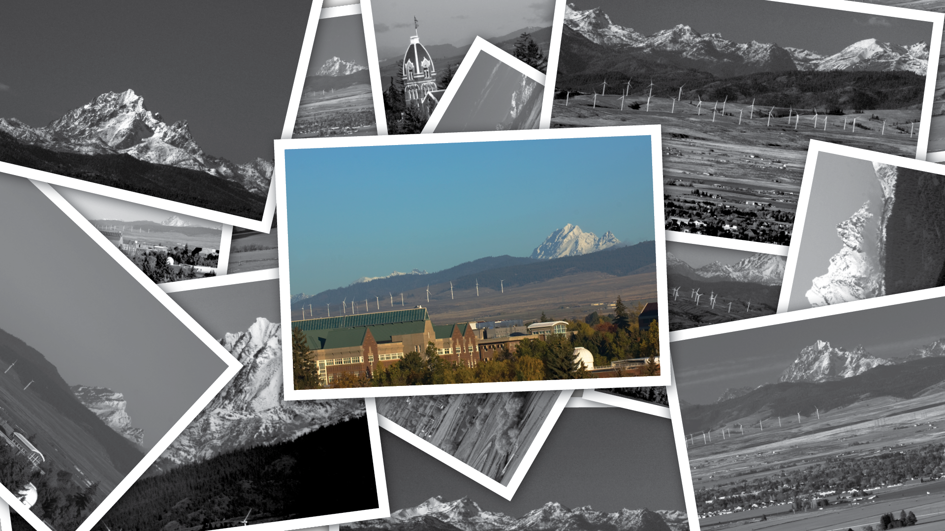
THE PROPOSAL
The university's initial research suggested that beyond competitive programs, one of the main attractions to campus was the beauty of the region. Through several iterations, I included the mountain as a graphic element to incorporate into the logotype.
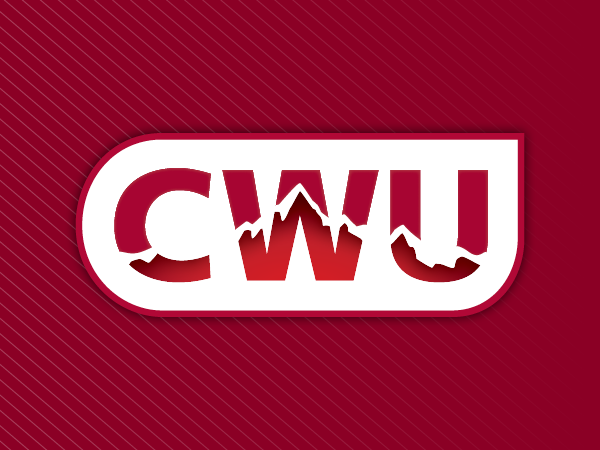
THE RESULTS
We arrived at a vector illustration that carried the essence of Mount Stuart, the same mountain that can be seen from campus. The peaks and slopes were accentuated for aesthetic and to improve the symmetry of the design. The logo has now been adopted as the official brand mark for the university and helped to launch a full overhaul of the CWU identity.