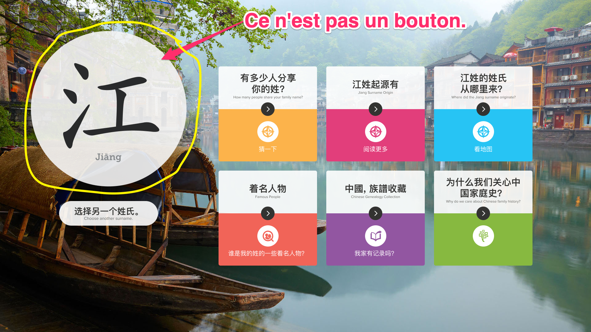
To borrow a phrase from René Magritte, "this is not a button", we had an issue with a design element. The Q/A came back negative with this particular component. They said, "this looks like a button, but when we tap on it there is no action." Indeed, this was not a button, but was a title element for the page. This page was an interactive kiosk screen to help users get information on their ancestors. Users could explore genealogical data in six interactive experiences by tapping the cards on the right. The large circle on the left shows them the family name that would be feeding the experience. They could change this by clicking on the pill-shaped button below and returning to the family name selector. In researching, I met with the team and particularly spent time understanding the need while working with a native speaker who could provide cultural and language-specific insight. Based on this data, I proposed and explored a modification to the circle element that would add a small amount of styling to convey that this was a title rather than a button.
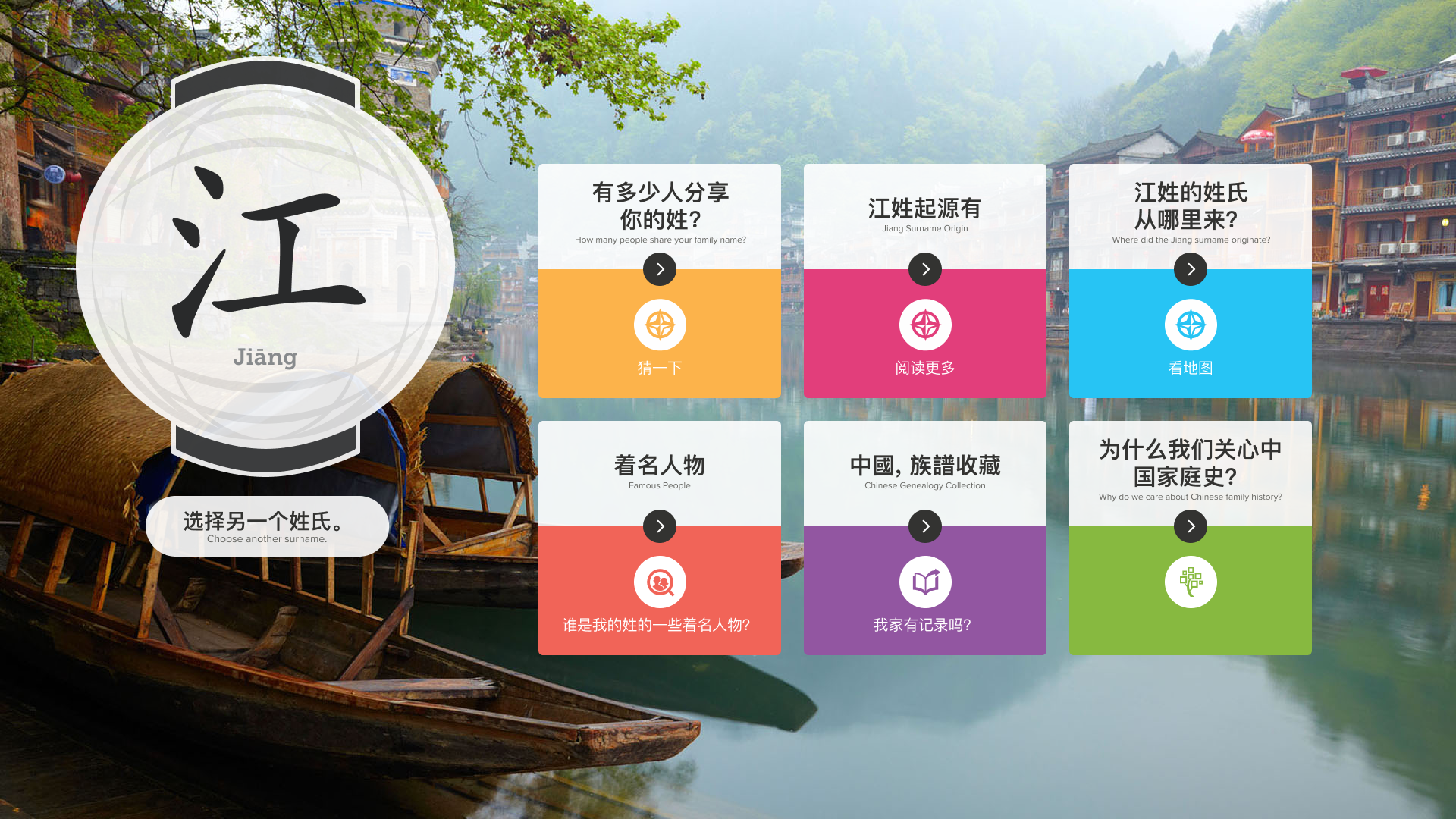
The solution was to reference the cultural icon of the paper lantern. The lantern is very common in native culture. It has many uses, but is always a symbol of light and hospitatlity. A fellow Chinese team member explained that anciently the lantern was hung on the family's home during festivals which confirmed the validity of it's use in our design. The Lantern would have unique patterns, words, or even the family's last name on them to help family members find their way home in the dark. This felt like a perfect match to the spirit of the FamilySearch mission to connect our users to their family members across generations. As a designer, balancing and combining multiple variables to create experiences that delight, inform, and facilitate the needs of the individual is needful. This was all of those things. Engaging visuals, storytelling, research, optimization, and delight all delivered at the right moment for an idea experience.